Bene · Independent concept
Prototyping benefits enrollment as a decision-support system.
Benefits tools often present plans, accounts, costs, and guidance as separate features. I designed and built a working concept that connected those decisions into one responsive enrollment experience.
- Role
- Product Designer and Builder
- Domain
- Employee benefits
- Scope
- Product strategy, information architecture, content design, prototyping
- Project type
- Independent working concept
Prototype proof
Enrollment flow
End to end
One connected experience
The concept connects plan selection, benefit accounts, dependents, cost, guidance, and completion.
Eligibility and guidance
State aware
Responds to each choice
Content, advisor messages, and available actions change according to the user’s selections.
Running cost
Always visible
Cost inside the decision
The estimated total updates as benefit decisions accumulate across the experience.
Bene is an independent concept and working prototype, not a shipped product. These points describe what the prototype demonstrates.
Thesis
The opportunity wasn’t to simplify benefits. It was to structure the decisions more clearly.
The opportunity
Enrollment tools separate decisions that affect one another.
Choosing benefits involves a series of connected decisions: comparing plans, estimating costs, understanding account eligibility, adding dependents, and deciding when guidance is needed.
Many enrollment experiences present those decisions as separate steps or features. I used benefits-domain experience, competitive analysis, and public KFF data to explore what a more connected decision-support model could look like.
Findings
What I found
- Decisions are interconnected
- A plan choice can change account eligibility, cost, guidance, and the actions available later in the flow.
- Generic guidance loses value
- Advice becomes more useful when it responds to what the person has already selected or remains uncertain about.
- Cost is usually separated from choice
- Users often have to leave the immediate decision to understand its effect on their overall benefit cost.
The decision
Treat enrollment as decision support, not a sequence of forms.
The experience needed to remember what the user had already decided, explain the implications of the current choice, and keep progress and cost visible throughout the flow.
Design responses
The concept tested three connected product systems.
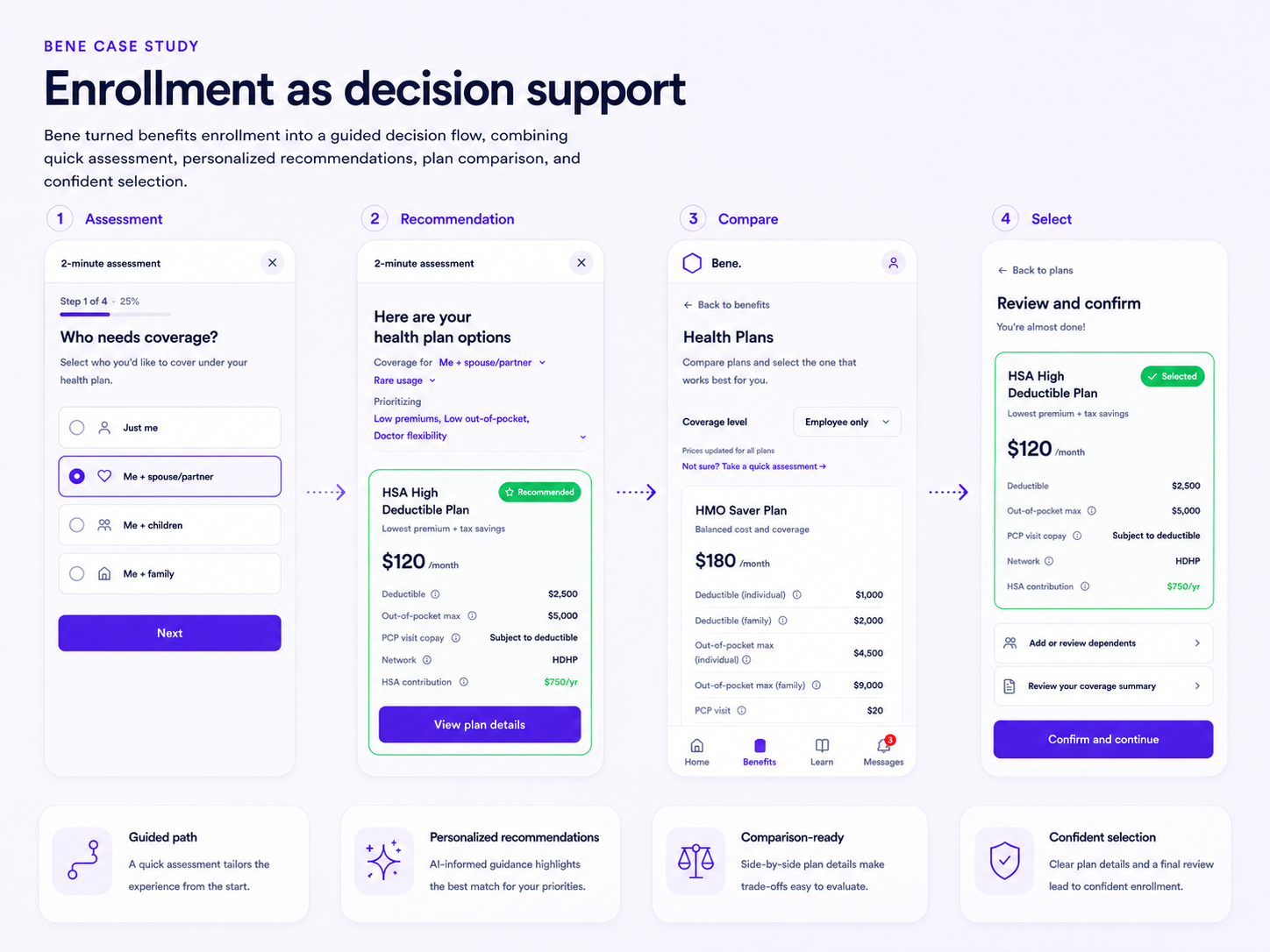
Enrollment as decision support
Each step combines the immediate choice with the context needed to make it. Plan comparison, progress, recommendations, and next actions work together rather than appearing as disconnected tools.
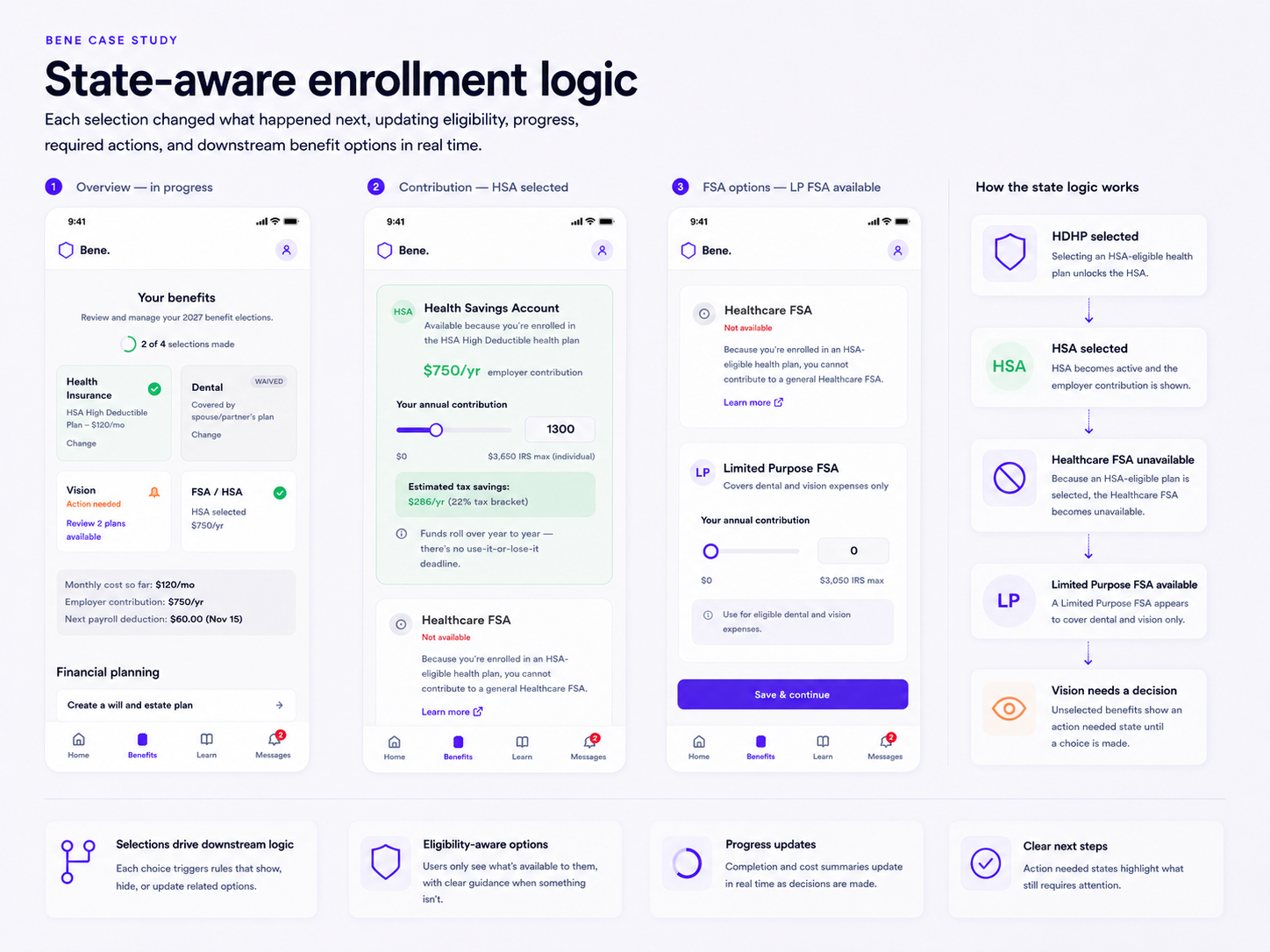
Content that changes with each selection
Eligibility, recommendations, advisor messages, notifications, and next actions respond to the choices already made. The experience becomes more specific as the user moves through enrollment.
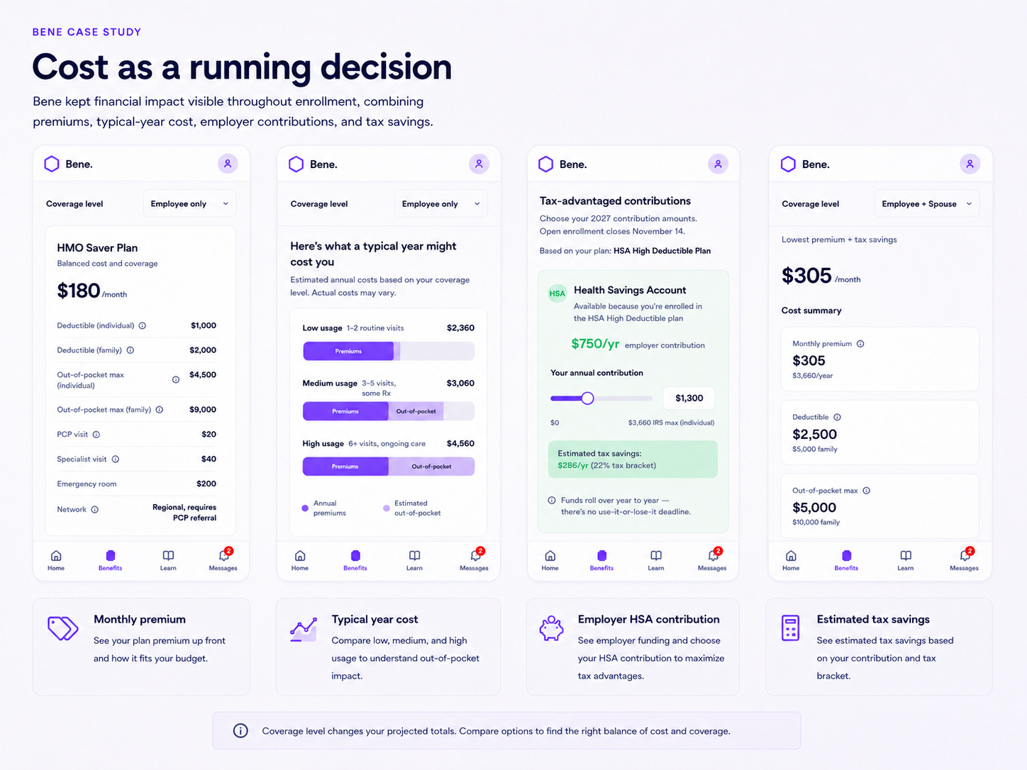
Cost as a running decision
The estimated total remains visible and updates as plans, accounts, and dependent choices are added. Users can understand the cumulative effect of a choice at the moment they make it.
How I built it
AI accelerated the build. Product judgment shaped the system.
I defined the product premise, enrollment architecture, content model, state logic, and design direction. I then used Lovable to turn those decisions into a functioning prototype quickly enough to test the experience as a system rather than as a collection of static screens.
The AI-assisted build made iteration faster, but it did not determine the strategy. I remained responsible for deciding what the product should do, how its states should behave, and whether the resulting experience made sense.
Define
Product model
Enrollment flow, decision points, content hierarchy, and system behavior.
Build
Working experience
Functional routes, interactions, states, and responsive interface.
Evaluate
Logic and coherence
Progress, eligibility, messaging, downstream actions, and edge cases.
What the build exposed
Working software revealed problems static screens would have hidden.
Once the concept was functional, interactions could be evaluated across routes and states rather than one screen at a time. That exposed inconsistencies in progress, eligibility, messaging, unread counts, and linked actions.
The prototype was revised to correct issues including HSA and FSA logic, advisor-message behavior, compare-all-plans routing, dependent verification, progress completion, and notification counts.
- Progress had to reflect reality
- Completion indicators needed to match unfinished actions and final verification.
- Content needed shared state
- Advisor messages, notifications, and eligibility rules could not behave as isolated interface elements.
- Every action needed a destination
- Building the routes exposed dead links and missing downstream experiences that static screens could conceal.
What changed
From a benefits hub to a responsive decision system.
The finished concept connects decisions that are often treated separately. Plans influence accounts, selections influence guidance, progress influences notifications, and every choice contributes to a running view of cost.
The result is not a simpler benefits domain. It is a clearer structure for navigating that complexity.
Reflection
What I’d carry forward.
AI made it possible to move from product premise to working experience quickly, but speed only became useful when paired with a clear model of the decisions, states, and dependencies underneath the interface.
The most valuable part of building Bene was not producing more screens. It was being able to test whether the product logic held together across an end-to-end experience.