Case study · IQVIA Patient Portal
Redirecting a visual redesign toward the patient journey.
The team expected a visual refresh. Research showed that the more important problem was helping clinical‑trial participants understand what was happening, what they needed to do, and what came next.
- Role
- Product Designer
- Domain
- Clinical trials
- Scope
- Research, product strategy, interaction design
- Scale
- 210K+ participants
Thesis
The interface wasn’t the problem. Patients lacked the right context at the right moment.
Context
The assignment started as a visual refresh.
The Patient Portal supported more than 210,000 clinical‑trial participants. The existing experience was functional, but the team believed its aging interface was contributing to poor engagement.
Before redesigning it, I led a focused research effort to understand how participants actually experienced the portal during a trial.
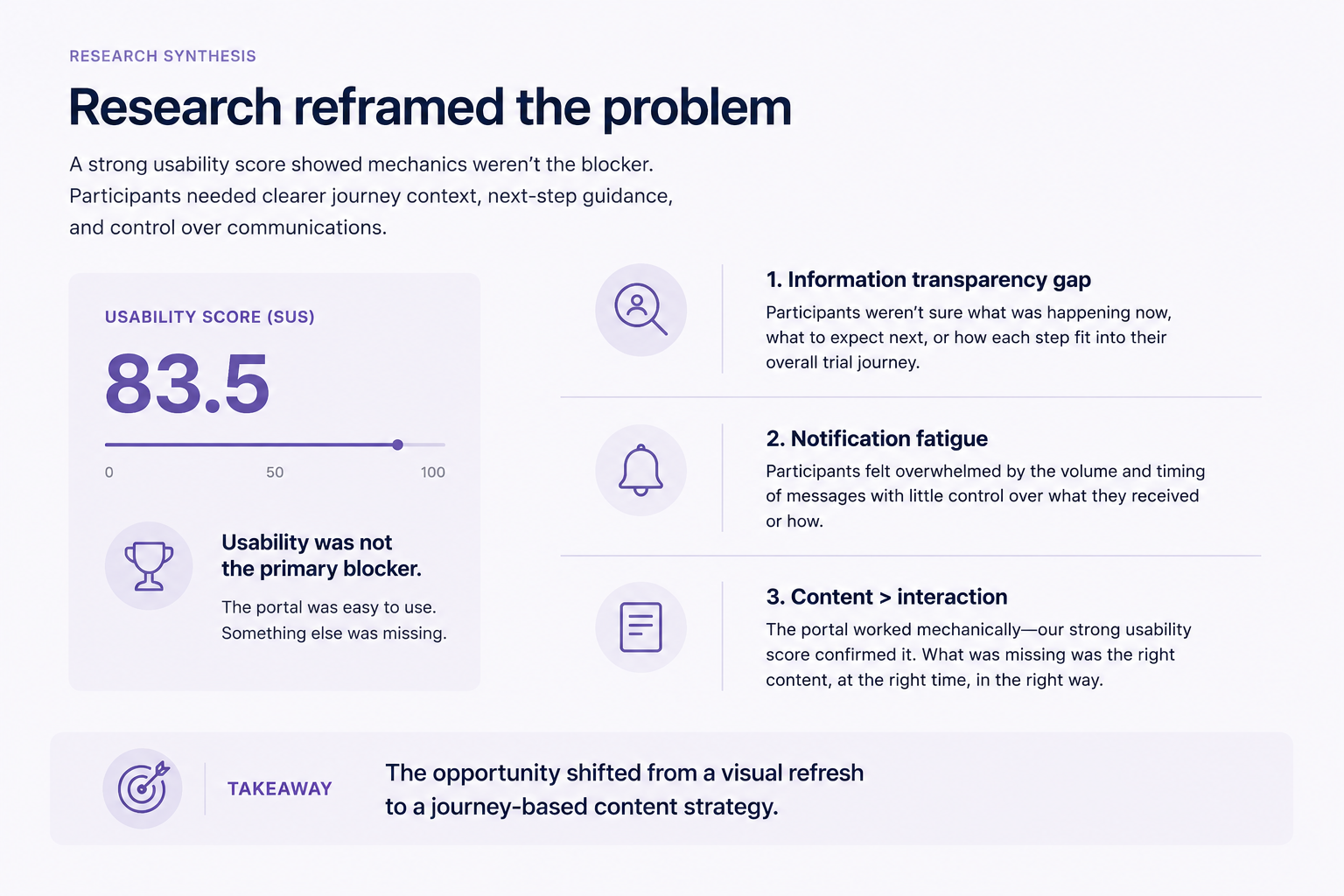
Findings
What I found
- Visit uncertainty
- Participants were often unsure how to prepare for visits, what would happen during them, or what came afterward.
- Notification fatigue
- Frequent reminders created noise without necessarily helping participants understand which actions mattered most.
- Missing journey context
- The portal showed individual tasks, but not where participants were in the larger clinical-trial journey.
The decision
Design for the patient journey, not the interface refresh.
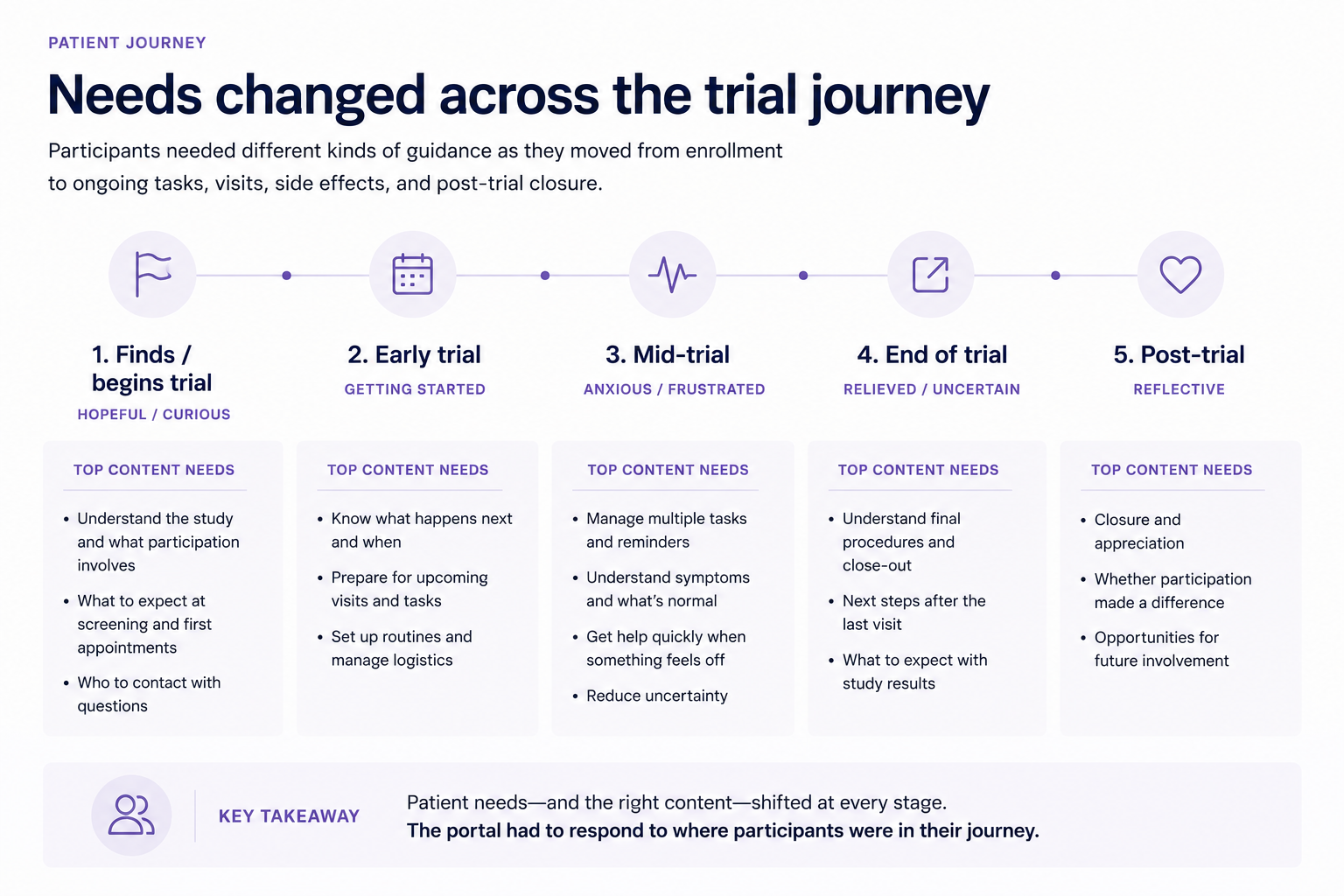
The research redirected the work. Rather than beginning with visual modernization, we focused on helping participants understand their current stage, prepare for upcoming events, and manage communication more intentionally.
Design responses
The experience needed to do three things better.
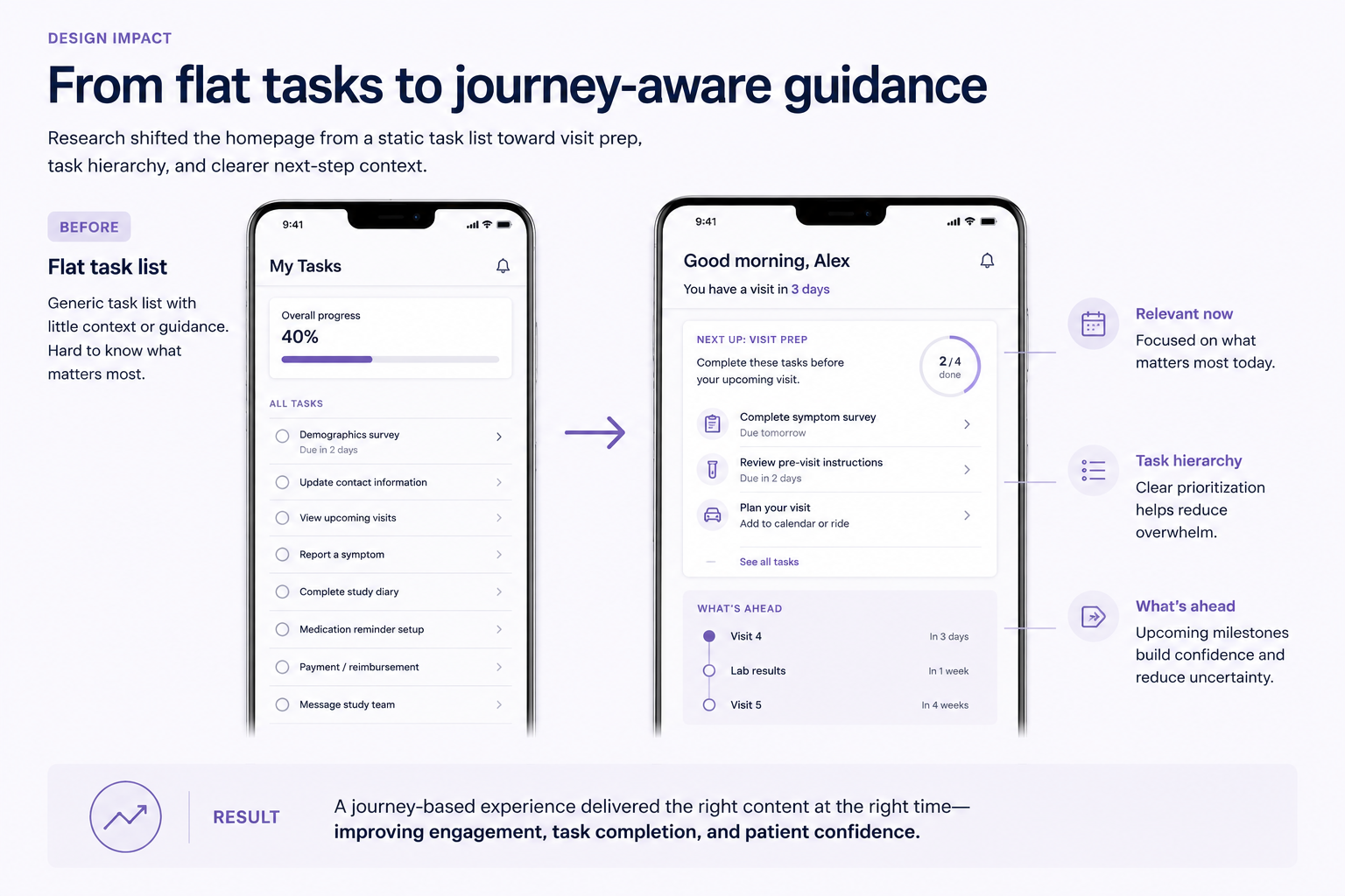
A journey-aware homepage
The redesigned homepage prioritized required actions while also showing participants where they were in the trial and what was coming next.
Visit preparation and what’s ahead
The experience gave participants clearer expectations before visits, including what they needed to do, what the visit involved, and what would follow.
Communication preferences
Instead of relying on a growing volume of reminders, the concept gave participants more control over reminder timing, frequency, and communication channel.
Preference model
Timing, frequency, and channel became participant-controlled inputs rather than defaults set by the trial, letting reminders adapt to each participant’s routine.
What changed
From flat tasks to journey-aware support.
The proposed direction shifted the portal from a flat collection of tasks toward a journey-aware support system.
Participants could still see what required immediate attention, but the experience also helped them understand why it mattered, how to prepare, and what to expect next.
Outcomes
210K+
Participants supported
The portal served a large and varied clinical-trial population.
Direction reset
Research changed the brief
Research moved the team away from a primarily visual redesign and toward journey-based guidance.
Repeatable sprint
Approach reused
The focused two-week research sprint became a repeatable approach for evaluating other product questions.
Reflection
This project reinforced that a dated interface and a poorly framed experience are not the same problem. The portal did need refinement, but visual polish alone would not have addressed the uncertainty participants experienced throughout a trial.
The most valuable design contribution was not a new screen. It was helping the team recognize that the product needed to orient participants across time, not simply present their next task.